NT SYSTEMS – ELECTRIC NAUTICAL PROPULSION SYSTEMS
Product Design
Project team: Andrej Kregar, Tomaž Perme
Client: NT Systems
NT Systems is a young Slovenian startup that develops advanced products in marine propulsion, electrical engineering, and electronic systems. From the start, the company has focused on innovation and precision. At the same time, it places strong emphasis on elegant, modern design.
Product Design and Visual Identity
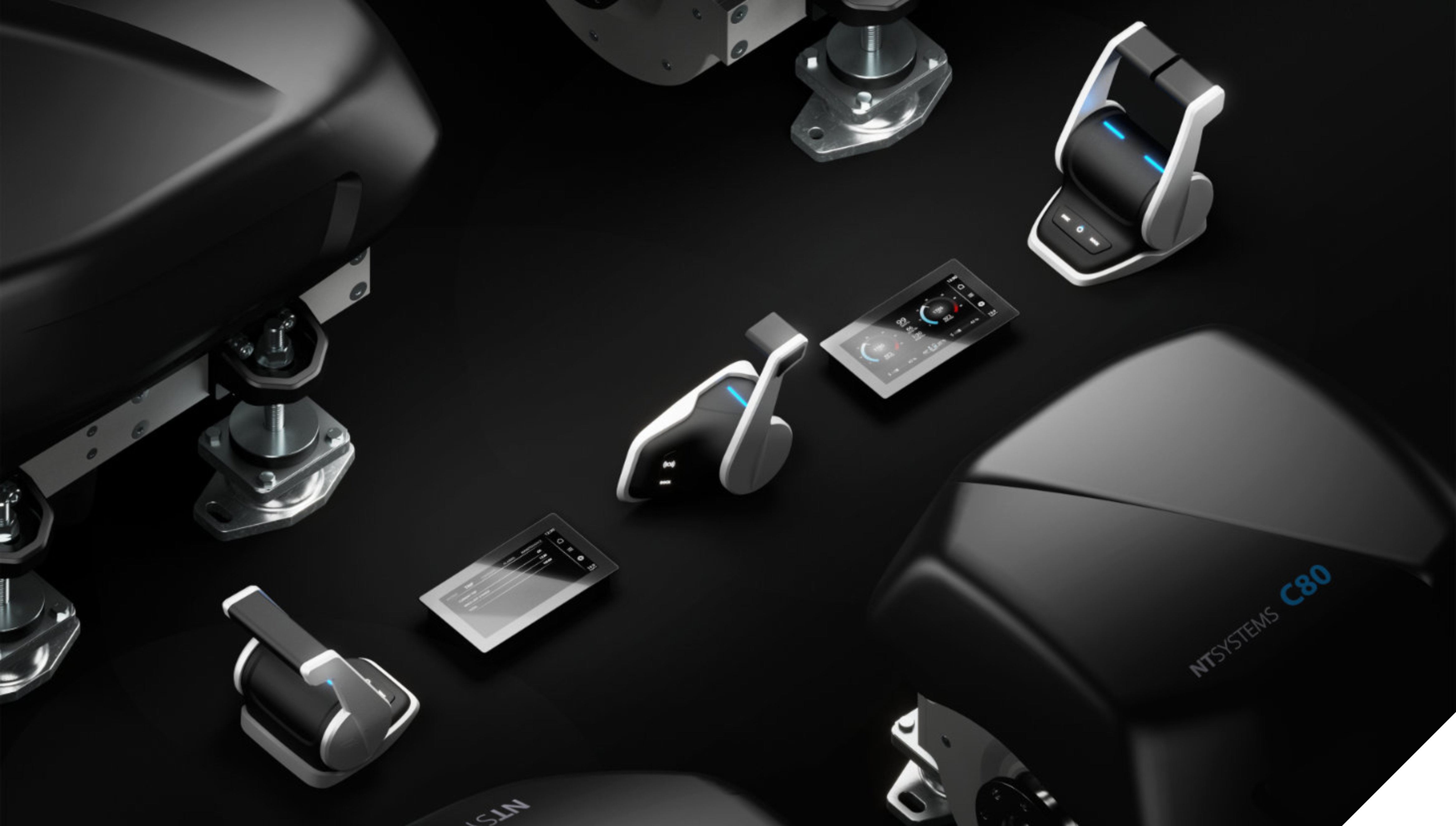
We designed several products for NT Systems and also created their supporting communication materials. At the core, all solutions share compact and organic forms. Moreover, the black, gray, and blue color palette reflects the brand’s modern identity.
In addition, we developed a complete branding system. This included the logo, UX/UI interfaces, and a unified graphic language. As a result, the products, digital tools, and communication channels now follow one consistent visual direction.
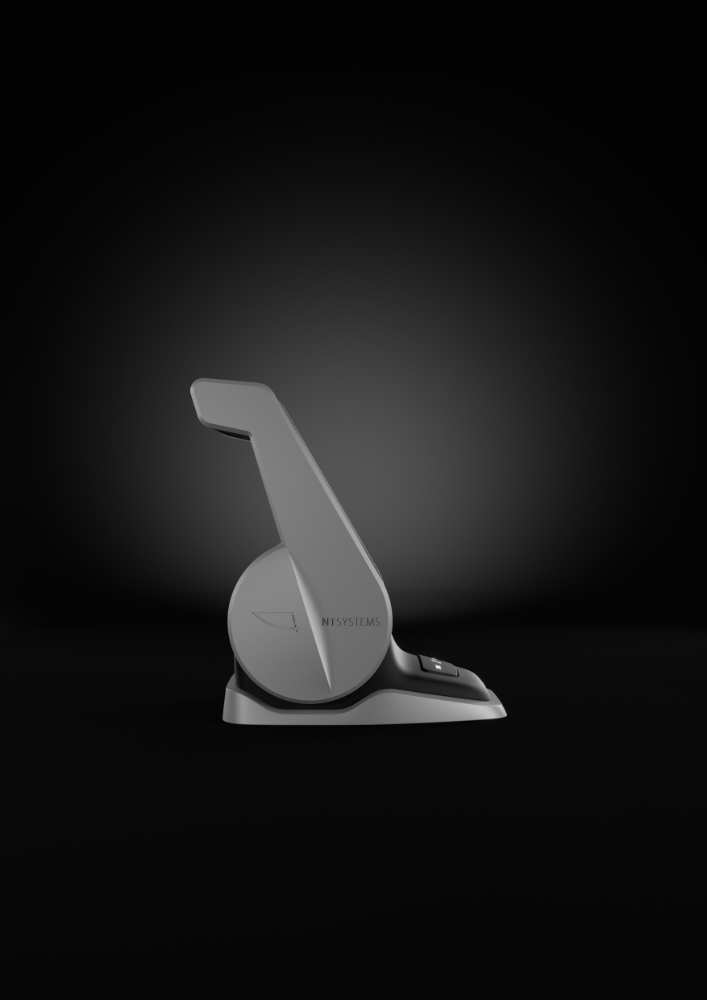
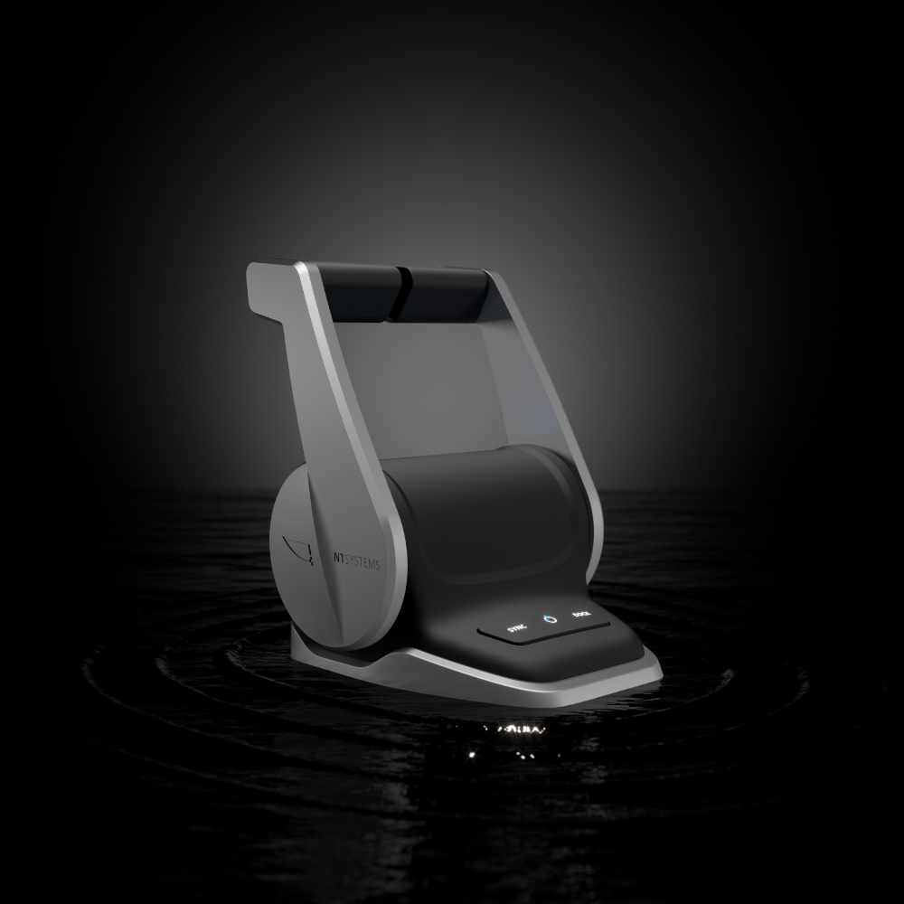
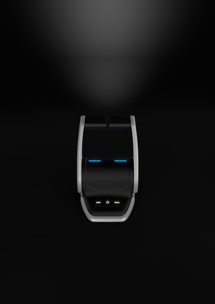
Control Levers: Compact, Ergonomic, and Intuitive
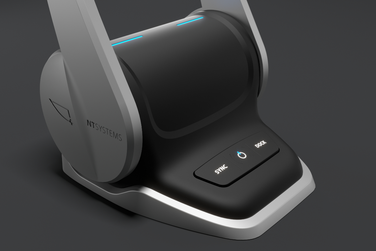
Our collaboration began with the design of the control levers. At this stage, the main challenge involved limited dashboard space. Therefore, the levers had to combine compact size with full functionality.
At the same time, we focused on clean proportions and strong button visibility. In addition, we enabled comfortable one-handed use of both levers. As a result, the final product feels intuitive and precise.
For this reason, we selected a combination of metal and plastic. Consequently, the levers remain durable, ergonomic, and pleasant to the touch.
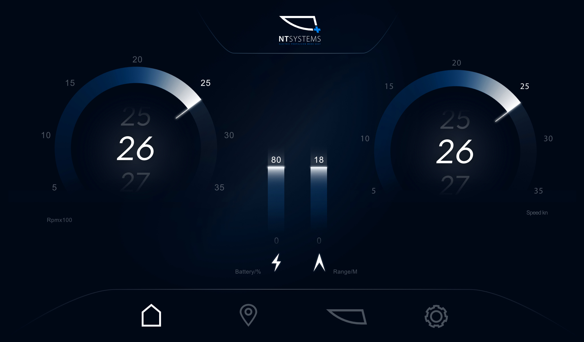
Screen and User Interface
In addition to the levers, we also designed the dashboard screen and its graphical user interface. Here as well, clarity remained the priority. Therefore, we focused on intuitive navigation and easy-to-read information.
As a result, users can quickly understand system status and react with confidence.
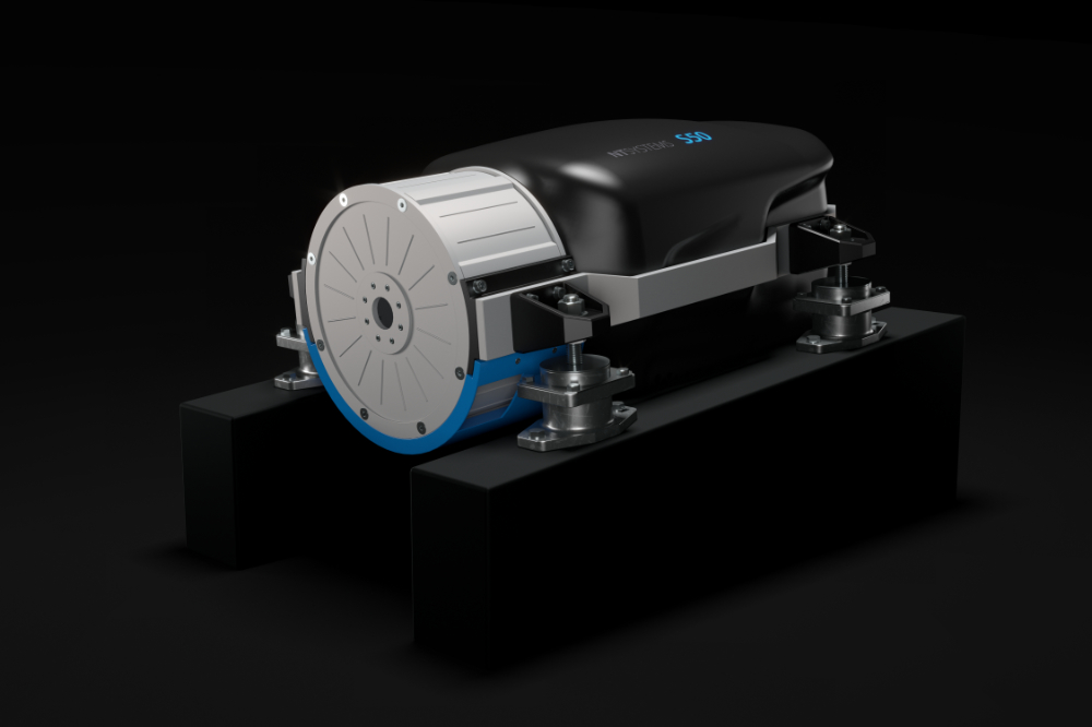
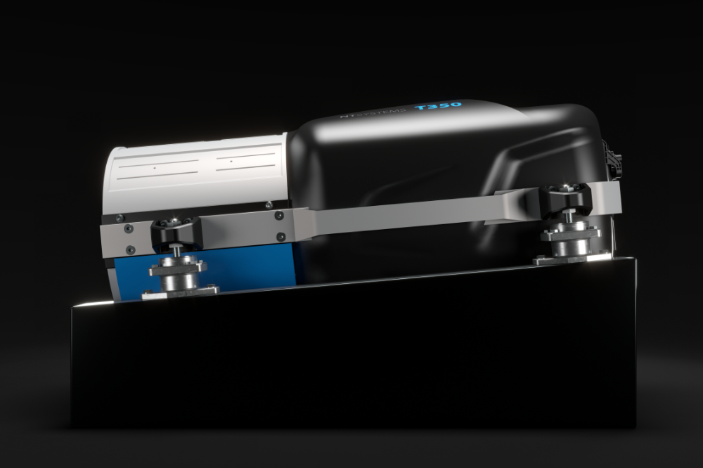
Engine Design: S50 and T350
Compactness and organic shaping also guided the development of the S50 and T350 engines. From the beginning, efficient use of space played a central role. Therefore, the engines occupy as little room as possible.
At the same time, their form visually connects with the rest of the product line. Likewise, they follow the same black, gray, and blue color scheme. As a result, the engines feel like a natural extension of the brand.
Completing the Brand Experience
To complete the overall experience, we also prepared user manuals aligned with the visual identity. In this way, consistency extends beyond the hardware and into everyday use. Ultimately, this approach strengthens brand recognition across all touchpoints.
- CONTACT
- 031 345 400
- info@kreatif-design.com
- ADDRESS
- Sinja Gorica 105b
- 1360 Vrhnika
- Slovenia

